By David Frangeul, Senior Director, Global Air and Ground Practices
With travel markets changing constantly, proactively managing your air program strategy is crucial to the success of your travel program.
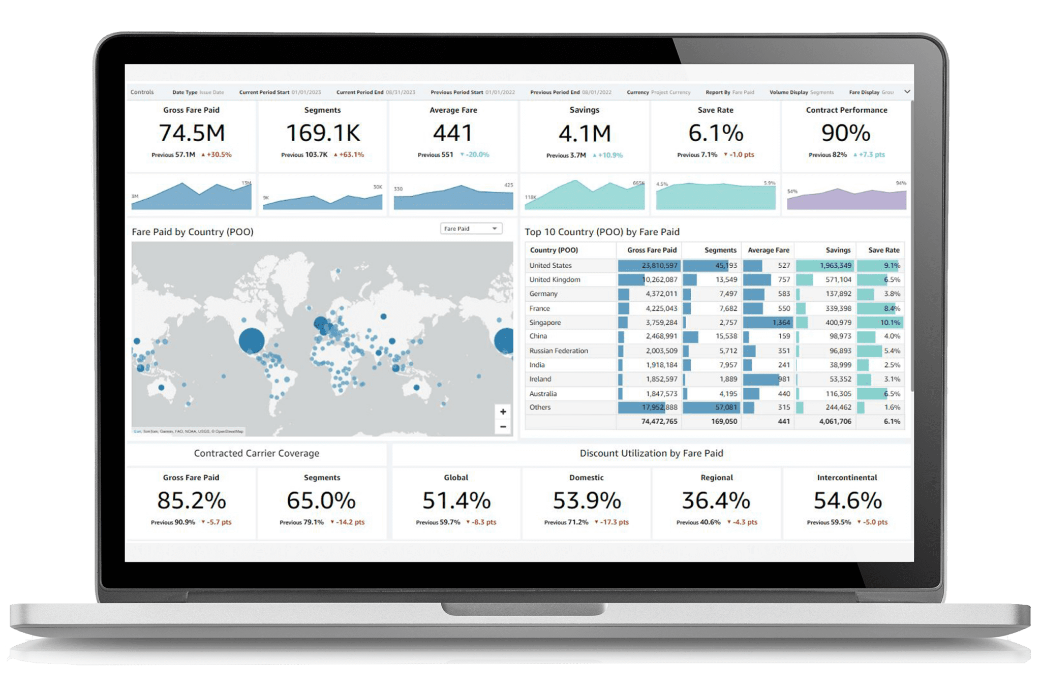
And the secret to a successful strategy is accessing the right data to glean valuable insights. That’s why we’ve revamped our Air Performance Dashboard, an essential tool for evaluating your air program data. Before diving into what’s new, here’s how the Air Performance Dashboard works.
Dynamic management of air performance
The Air Performance Dashboard is part of our dynamic performance management (DPM) approach. It can help you run ongoing optimizations in your travel program based on the latest data from both your own program and the market as a whole. Not only is our dashboard available for you to view your data in real-time, but our team of expert air consultants extract valuable insights from the dashboard to provide recommendations for optimizing your air program throughout the year.

The dashboard uses advanced data and analytics to provide a full picture of your air program performance, assessing a range of key performance indicators (KPIs) such as fare paid, average fare variance, savings, carbon emissions, and more. Plus, it monitors activity and trends which can be used to pinpoint opportunities for improvements and savings. This can help you identify ways to engage and influence travelers, develop data-driven strategies for negotiating with carriers, and adjust your program as needed during the year.
What’s new in the Air Performance Dashboard
We have recently upgraded the Air Performance Dashboard to make it an even more useful tool for our clients and consultants. Here’s a snapshot of the new and updated features.
1. Updated interactivity & improved speed
The Air Performance Dashboard has a new look and feel, making it more user-friendly and improving interactivity. That means that users will be able to navigate the tool easily, with multiple ways to look at and filter their travel data.
Along with interface upgrades, we’ve improved the speed and response time, so you can see your data instantly. This in turn means you can make your program even more responsive as market data changes.
2. New data features
There are several new data features which allow for much more granular analysis. Some of the new data features include:
- On the fly currency conversion, so you can easily look at data in whichever currency you want, no matter what the source currency is
- Enhanced airline contract status identification
- Program performance across carrier groups
- Booking trends by cabin class
- How discounts are being used in different markets
The Air Performance Dashboard can help you assess where your spend is concentrated, behavior by carrier and market, competitive carrier information by market, and benchmarks. With all of this data in one place, you can easily identify gaps in coverage and savings opportunities.
With these insights, you’ll know how and when to engage with travelers to guide behavior that supports your program.
3. Advanced KPIs
The refreshed dashboard includes a range of advanced KPIs, such as discount utilization, savings rates, contract performance, benchmarks, and competitive carrier information. All data can be presented and filtered in a number of ways, over different time periods, allowing for deep analysis and actionable insights. For example, if you have a threshold of 50% discounted spend and see that you’re not meeting that threshold, you can dig down into the data and see where the shortfall is coming from, then use that to dictate where you need to negotiate rates.
4. Integrated sustainability data
Sustainability is a key priority right now, so we’ve added sustainability data directly into the Air Performance Dashboard. Our proprietary fair market share calculation, the environmental quality of service index (eQSI,) is integrated into the dashboard, along with our ISO-certified GATE4 emissions methodology. The eQSI takes carrier fleet fuel efficiency into account, rewarding more sustainable carriers with a higher score. This can help you understand which carriers best support your sustainability goals.
5. More what-if scenarios
Finally, there are now additional what-if scenarios to model what changing aspects of your program would mean for the program goals. These quick savings calculations tools help you consider the effect of policy changes on your savings, carbon emissions, and more.
As part of an overall dynamic approach to program management, the Air Performance Dashboard allows you to take a deep dive into your data and get the insights you need to identify risks and opportunities, stay ahead of market trends, guide traveler behavior, and optimize your air program in real-time. Plus, with the expert support of Advito’s skilled air consultants, you’ll be well-equipped to take a proactive approach to air program management and successfully reach your goals.
To learn more about Advito’s dynamic performance management approach and the Air Performance Dashboard, contact our team: https://www.advito.com/contact/.
